Or how I learned to stop worrying and love "fake" data.
A question we at neurocat often get about the augmented data we generate with aidkit is whether it is as good as real data. “Good” being a subjective term, the real question is whether they capture the same thing.
The augmented data may look real to you and me, as we showed off here, but what does the algorithm think? If you test or train a perception model using augmented data, is the augmented data a close enough proxy to real data that it can improve your perception system's real-world performance?
To answer these questions, we conduct method validity experiments. These experiments help us to learn and improve, give our clients confidence in data augmentation, and prepare us both for future regulatory requirements.
Recap: Why we augment
Before diving into method validity experiments, let's quickly review why we use augmented data for machine learning (ML) development.
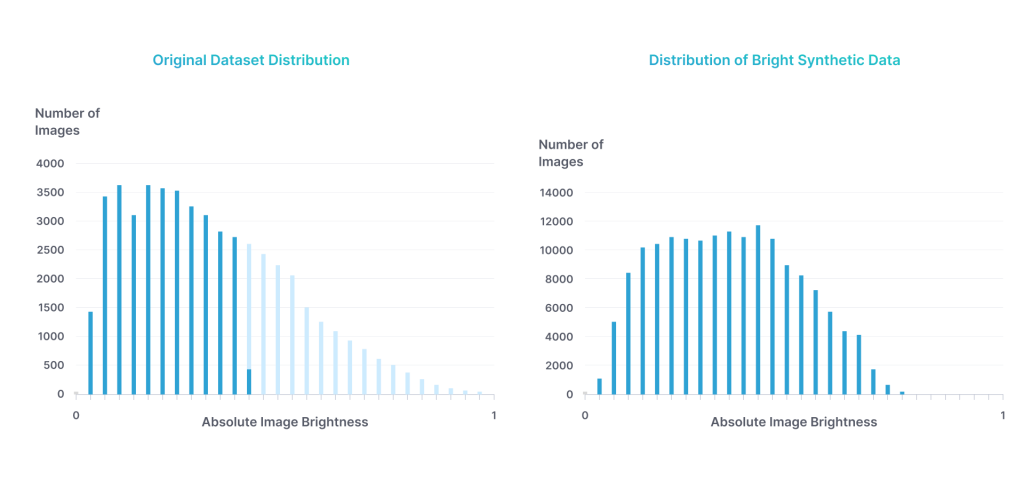
A problem in ML is data, which can be scarce and expensive to acquire in sufficient quantities. Moreover, even if data can be acquired in mass, it can be difficult to obtain a fully representative distribution of that data. Dominant weather patterns in a region, for instance, can lead to unbalanced datasets or, for example, long waits for that one sunny day in Seattle. Edge cases can be even more challenging to acquire, yet also often the most safety critical scenes.
Here augmented data rides to the rescue: it allows one to create a balanced dataset so one can properly develop an ML model in the first place, and ensures that the training leads to a model that performs well in the ODD no matter, for example, the weather on a particular day. But first we need to be confident that this augmented data is real enough to capture reality.
How we validate the goodness of augmented data
We begin our experiment by asking the question: does the synthetic data we create and the real data we collect affect model performance in the same way? If the synthetic data is similar to real data, model performance on the two should be similar.
To answer this question, we first need to have two data sets: the real data, and the augmented data. We then need the model(s) we want to test.
With these ingredients, our first step is to test the model(s) on the real data, and on the augmented data, to see how they perform on each data set. Then we can use the performance on the augmented data to try to predict the performance on the real data.
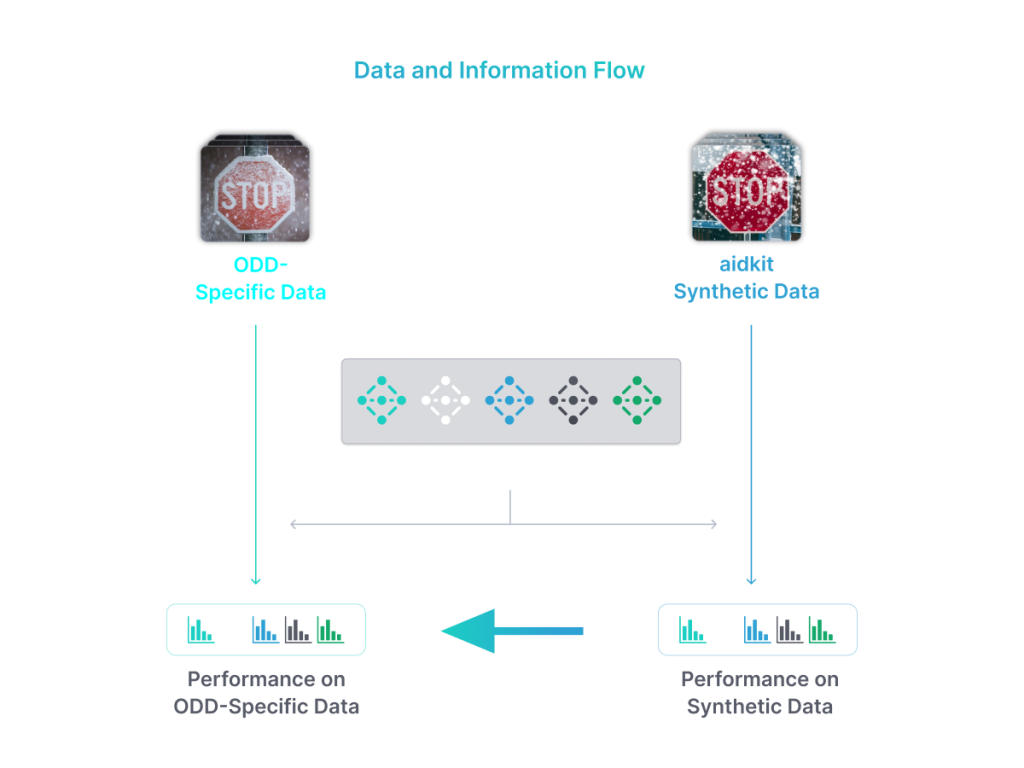
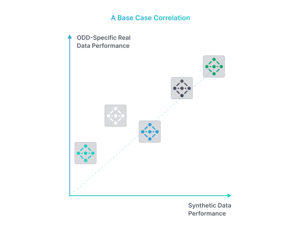
To show such correlation though, we need a variety of different models with, for example, different data splits. At least some of these models, possibly most, can be trained explicitly for testing (since real-world use of models trained on unbalanced data is … limited). What we expect, if we have done our job properly, is a relationship between the two, such as seen in Figure 3.
Setting up for our validity test
Let's take this recipe now and show how it's done in the kitchen. Here we describe our baseline test which uses data from the German Traffic Signs Recognition Benchmark (GTSRB) and which is what we show to customers to explain how method validity experiments work.
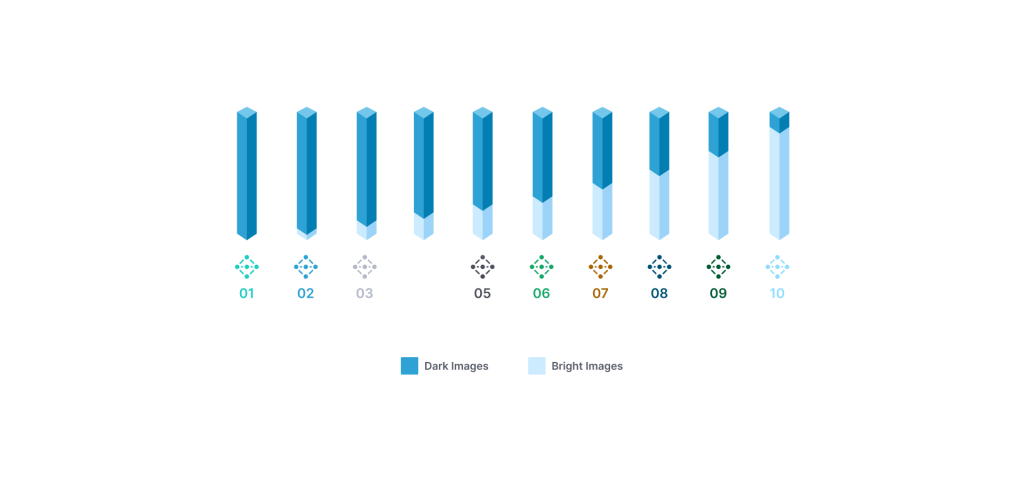
For this example, let's assume you have real data on which you have trained a road sign classification model. However, because you collected in Seattle, you have more dark images than bright images. You are concerned about the unbalanced data and thus interested in augmenting your data. But first you need to know if the augmented data is comparable to real data, so you ask neurocat for help.
To prove comparability, we first classify your data into bright and dark images. We then create subsets of the data and use these to train 10 models, each with different proportions of dark and bright images, as show in Figure 4. (Naturally if you already have pre-existing labels and even models, we can use these).
Next, we use aidkit to generate augmented data based on the real images you provide. In this case, we are brightening the images to get our sunny day in Seattle. In principle, we can also train models with this data, but this we are sticking to the baseline case here as training with augmented data is another full conversation (stay tuned!).
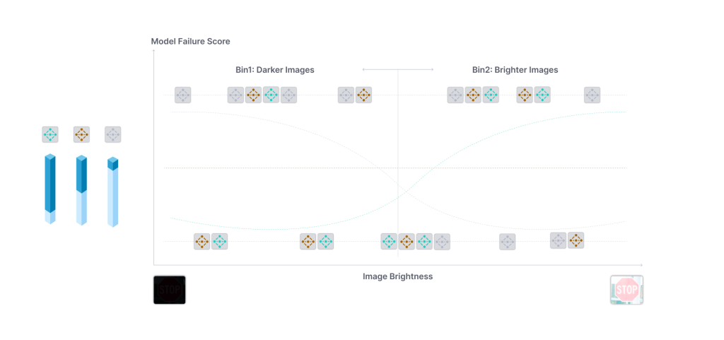
Now we can test our models on the test splits of 1) our real data and 2) the synthetically brightened image data. The results for each mode might look something like this:
Comparing real and fake data
Lastly, we need to compare these results. There are different approaches one could take here. The most important thing is to follow all the rules for proper statistical analysis and have the results to be understandable.
Since our outcome of intertest (our dependent variable) - model failures - are binary values (a model failed on an image, or it didn’t) any binary classification algorithm will work. Here we prefer the ever-reliable logistic regression, as it’s a well-known and understood algorithm and people know how it comes to its conclusion.
The independent variables that the logistic measure the impact of needs to be something equally computable for real and synthetic data. So brightness works here for us, but some metric like "corruption severity" does not since real data has no natural “corruptions”.
Thus, the question the regression will answer is at which level of brightness did a model fail? We feed each model many images of varying brightness and see which level of brightness a model fails on. We call this the Model Failure Rate (MFR).
The MFR is what we can then use to see if the synthetic data is similar to real data (at least from an algorithm’s perspective). We do this by comparing the two parameters by which a logistic regression curve is described: the weights and bias. These describe the shape and slope of the curve and the height of the curve respectively.
In our baseline tests (the one referenced above that we show clients) when comparing the weights and bias terms of each model for synthetic and real data, we observe a high correlation, shown in Figure 6.
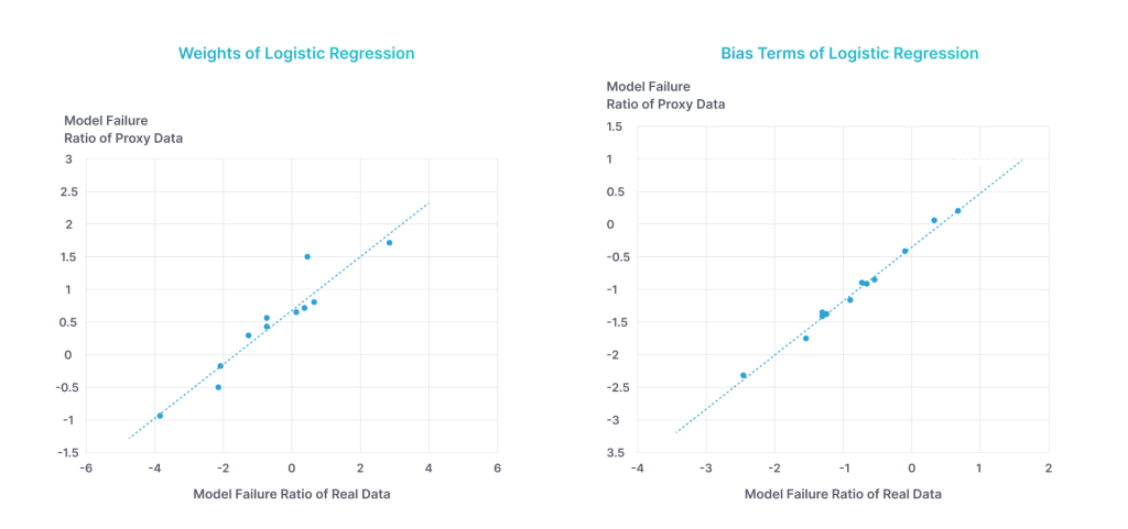
This nice correlation indicates that the overall trend of the models is similar for real and synthetic bright data. What this ultimately means then, and the point of the exercise, is that in this case the perception system tests performed by aidkit using synthetic data can serve as a proxy for real data. The test results would be the same with either type of data.
Conclusion
Herein, we presented a case where the real data and synthetic data correlate. The reason they correlated though was the thought we put into the depth of the augmentation. We make all our augmentations in a building block fashion as outlined above: thinking first of the core condition such as rain, then thinking of the effects this condition has on the environment and how the camera/vehicle's perceived that environment, such as reflections, splash, and droplets.
And this is the meta-point of this article: we have to measure to see if synthetic data correlates to real data, because if not done properly it may not. Augmentations for data need to be well designed and executed or what they teach your ML model will be miles away from real world behavior.
Equally important as statistical proof of validity is human visual aspect. You can read here about how we make our augmentations look visually appealing/real.
